


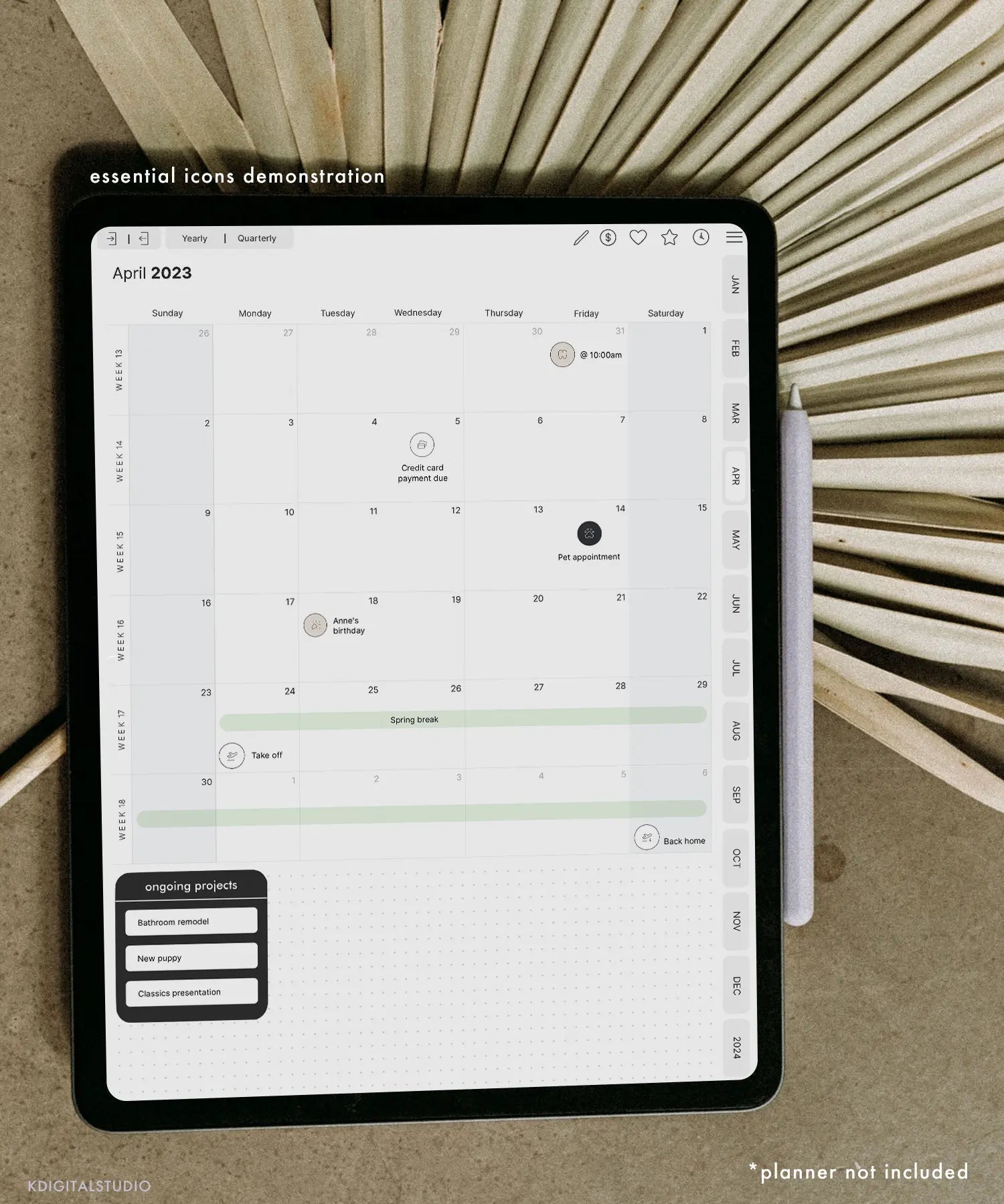
We've all seen those dreamy color-coordinated notes on Pinterest and thought, how do people have time for that? Good news: aesthetic notes aren't about being an artist or spending hours—they're about a few repeatable habits. Here's how to make your iPad notes genuinely pretty and genuinely useful this semester.
First rule: aesthetic should serve function
Pretty notes you never reread are just decoration. The goal is notes that are so clean and scannable that studying from them is easy. Every tip below makes your notes both nicer to look at and easier to use—that's the sweet spot.
1. Pick a small color palette and stick to it
The fastest way to look put-together is to limit yourself to 2–3 colors plus a neutral. Assign meaning to each—e.g. one for headings, one for key terms, one for examples. Consistency reads as “organized” instantly, and color-coding doubles as a study system.
2. Build a clear hierarchy
Big bold titles, medium subheadings, normal body text. Add generous white space between sections so nothing feels cramped. This one structural habit does more for “aesthetic” than any sticker.
3. Use two fonts max (if you type)
If you type some notes, pair one clean font for body text with one characterful font for headers. Handwriting-style fonts keep digital notes feeling warm and personal—the Kirstin Font is neat and readable for everyday notes, while Edmund and Hunter add personality to titles.
4. Let stickers do the heavy lifting
This is the shortcut that makes notes look designed in seconds. Instead of drawing, drop in ready-made elements:
- Sticky Note Digital Stickers for key takeaways and reminders that pop off the page.
- Planning Icons & Labels and Student Labels to headline topics and mark priorities.
- Life in Stickers or Hand Drawn Doodles for tasteful decorative touches that don't clutter.
Tip: my sticker sets come precropped for Goodnotes and as individual PNGs for Notability and other apps, so they drop in instantly.
5. Add a header or divider to each page
A simple date, title, and a divider line at the top of every page makes a notebook look cohesive and makes pages easy to flip through later. Washi-tape stickers work great as dividers—try Washi Tape Digital Stickers.
6. Reuse a template so you're not designing every time
The people with consistently beautiful notes aren't starting from scratch—they reuse a layout. Set up one page you love, then duplicate it. A hyperlinked planner or note template does this automatically. If you want to design your own, see How to Make a Digital Planner in Goodnotes.
7. Don't over-decorate
The most common mistake is too much. White space is your friend. If a page is hard to read, remove elements until it breathes. Aesthetic notes are usually simpler than you think.
Put it together
Small palette, clear hierarchy, one or two fonts, a few functional stickers, a repeatable template. Do that consistently and your notes will look effortlessly polished all semester. Want to watch it in action? I share note-taking and styling tips on my YouTube channel. And if you're still choosing an app, start with Goodnotes vs Notability.

Share:
Can You Sell Digital Planners Without Design Experience?
What You'll Learn in Digital Planner Design Lab (Full Course Breakdown)