

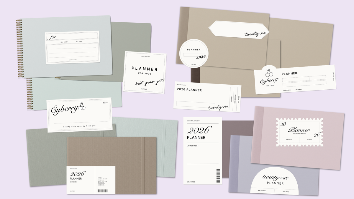
A planner cover might be the single most underrated part of the entire design, and it's also the first thing anyone notices — whether that's you opening your planner every morning or a customer deciding whether to click "add to cart." So if you're getting ready to design a 2027 planner, let's talk covers: what makes one actually work, and how to design your own even if you've never touched design software before.
Why the cover matters more than you'd think
A cover isn't just decoration — it sets the tone for the entire planner and, if you're honest with yourself, it's a huge part of whether you actually want to open the thing every day. I've redesigned the Cyberry cover every single year since 2020, and the years I nailed the cover are consistently the years people tell me they used the planner the longest.

Three cover styles worth considering for 2027
Classic: clean typography, a simple color block or gradient, minimal extra elements. This style ages well and looks professional years later — a safe, strong choice if you're not sure where to start.
Decorative: illustrated elements, patterns, or seasonal motifs layered around the title. This is where personality lives, and it's a great choice if your planner has a specific theme or aesthetic.
Stylistic: bold color, unconventional layout, maybe hand-lettering or a more artistic type treatment. This works well if you want your planner to stand out immediately, whether on a shelf or a product page.
Designing multiple variants without starting from zero each time
If you've ever shopped for a Cyberry planner, you know I never launch just one cover — light mode, dark mode, sometimes multiple colorways per orientation. The trick isn't designing each one from scratch; it's building one strong base design with swappable color and pattern layers, so a single afternoon of work turns into a full cover lineup. This is one of the most requested topics inside Digital Planner Design Lab, because it's the difference between offering real choice and burning out redesigning the same cover twelve times.
What actually makes a cover look "professional"
- Consistent margins and breathing room — resist the urge to fill every inch of space
- A limited color palette (2–4 colors max) rather than throwing in everything that looks nice individually
- Typography that's legible even as a small thumbnail, since that's often how it'll first be seen
- A cover and interior that actually feel like they belong to the same planner, not two different projects
Where to start if you've never designed a cover before
Start with the classic style. It forgives beginner mistakes far more than a decorative or stylistic cover does, and it teaches you the fundamentals — spacing, color, typography — that make every future design easier. Inside the course, this is exactly the order I teach it in: foundations first, then the more expressive styles once those basics feel natural.
Ready to actually build one instead of just planning to? Take a look inside Digital Planner Design Lab →
Want the covers without the design work? The Cyberry 2027 digital planner comes with a full set of coordinating covers in classic, decorative, and stylistic styles — ready to use in landscape or portrait, light or dark mode. Shop the 2027 collection here →


Share:
Monday vs Sunday Start: Which Digital Planner Week Actually Fits You?