

If you want to learn new techniques for lettering in Procreate despite feeling as if your handwriting or any style you try to adapt just looks… off, you’re in the right place! With these simple and very beginner-friendly techniques, you’ll be able to create a piece that you LOVE in Procreate and improve your freehanded lettering over time.
To start each piece:
I like to use a 3000x3000 sized canvas at 300 dpi. If you’re on Procreate 5x, I also like to go with the P3 color display. If you’re on an older iPad, sRGB works fine too! I love this size because if I decide to post on social media, I don’t lose much quality due to compression, and this size is seriously so perfect as a physical print (yes, I love printing my 70s lettering pieces to hang over my desk)!
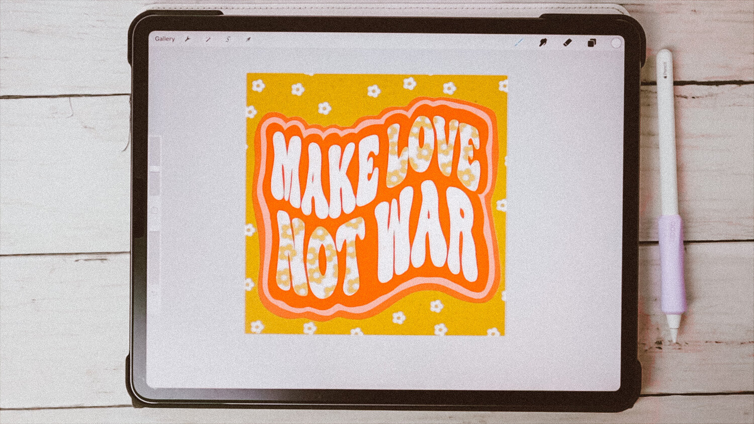
- On my canvas, I normally freehand the word/quote I want to go with. But, if you’re new to handlettering or aren’t confident in your ability to freehand, you can manipulate fonts to get the job done! Try using your selection tool on freehand mode to change the ratios of the font — either creating super long, flowy letters or short, blocky letters. I like to move the letters out of line, creating some bigger, others smaller. The liquify tool is fun to create more movement as well. You can also use the skeleton technique to build onto the letter or the additive/subtractive technique to add or take away features too!
- Once I have the word/quote how I like, I’ll create a new layer and trace over my sketch layer.
- If I want a more textured piece, I’ll shade/color in each letter. Otherwise, color drop can get you a nice seamless look!
- This is the fun part — trial and error. I always find myself duplicating my word/quote later and changing the colors around to create chunky shadows or drawing outlines to create nice contrast. I like making use of alpha lock and clipping mask to add fun designs, more texture, or different stamped motifs!
- I always stare at the piece. Change some colors. Add more embellishments. Try different textures. Stare at it a little more. Delete some things. Add more things… before I finally get a look that I like!
Over time, you’ll be grow more confident in freehanded your words/quotes and then with practice, you’ll see massive improvement. Fonts are truly a great way to learn how to handletter on the iPad (and in general)! It is using these techniques that have really helped me grow my skillset in such a short time. And the 70s lettering brush & stamp set I created to level up my retro lettering has saved me lots of time too!
Share:
How to Create Lag-Free Digital Planners
Extreme Office Studio Makeover & Transformation