

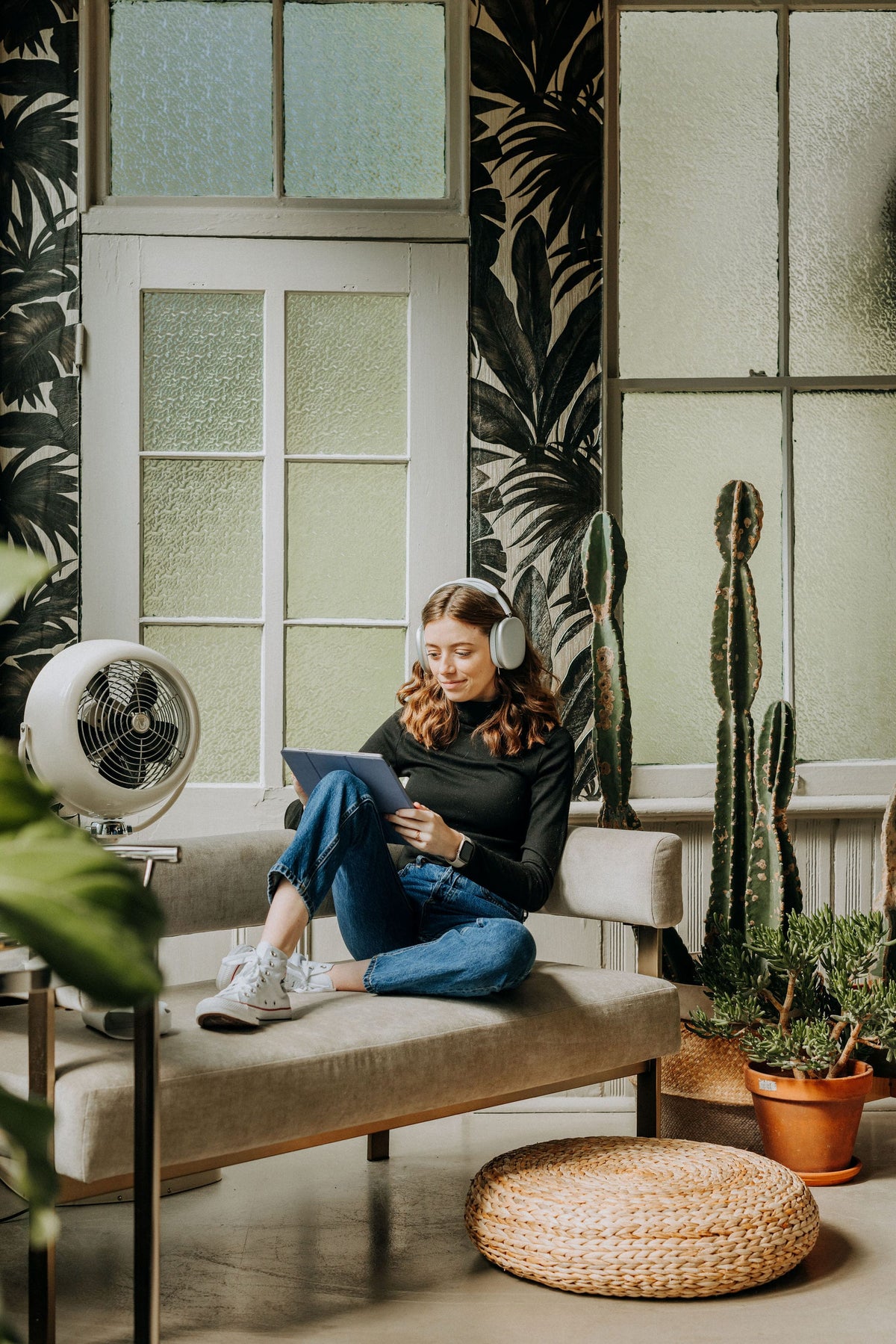
Your iPad home screen sets the tone before you even open an app, and there's something genuinely satisfying about opening your iPad to a cozy, coordinated fall setup instead of a cluttered grid of default icons. Here's how to put together a seasonal home screen — wallpaper, app icons, and widgets — without spending a whole weekend on it.
Start with a seasonal wallpaper
The wallpaper is doing most of the visual work here, so it's worth starting there before anything else. A fresh October wallpaper is already up on the blog, free to download, and built to set a warm, cozy tone for the whole screen without clashing with whatever icons you layer on top. I release free wallpapers every month, btw.

Give your planner app a custom icon
If you haven't set up a custom home screen icon for your digital planner yet, this is genuinely one of the highest-impact five-minute projects you can do. Instead of hunting for GoodNotes or Noteful in a folder, a custom icon means opening your planner is a single, satisfying tap — and it looks a lot more intentional sitting next to a seasonal wallpaper than a default app icon does. There's a full walkthrough on the blog if you haven't done this before, using the free Shortcuts app.
Add a widget row that actually earns its space
Widgets are where a lot of home screens go wrong — either totally empty or so packed with information it stops being calming to look at. Aim for the middle: one or two widgets that genuinely help (a calendar preview, a simple to-do list, a habit tracker) rather than every widget iOS offers. If you decorate your digital planner with widget-style stickers already, matching your home screen widgets to that same soft color palette makes the whole iPad feel like one cohesive system instead of two separate tools.
Coordinate your color palette on purpose
The easiest way to make a home screen look put-together is limiting yourself to a small palette — pull two or three colors straight from your wallpaper and stick to those across your icons and widgets. A wallpaper with warm terracotta and cream tones, for example, pairs beautifully with muted, earthy app icon colors rather than a rainbow of mismatched defaults.
Keep function in mind, not just aesthetics
A gorgeous home screen that buries the apps you actually use ten folders deep isn't really a win. Keep your most-used apps (planner, calendar, notes, camera) on the main screen even if they don't perfectly match your color scheme — you can always create custom icons for those too once you've settled on your palette. Aesthetic and function aren't actually in competition here; they just take a little more setup together.
Refresh it monthly if you want the habit to stick
One reason a seasonal home screen refresh works so well as a habit is that it's small enough to actually maintain — a new wallpaper each month, a quick icon swap if your palette shifts, five minutes total. The monthly wallpaper drops on the blog were built with exactly this in mind, so there's always a fresh, coordinated option waiting without you needing to design one yourself.
Once your home screen matches the season, it's a small but genuinely nice feeling every time you unlock your phone or iPad — cozy, intentional, and a little more "you" than the default ever was.

Teilen:
31 Reflective Journal Prompts for a Slow, Cozy Fall
How to Prepare for 2027: A Digital Planning Reset for a Fresh Start